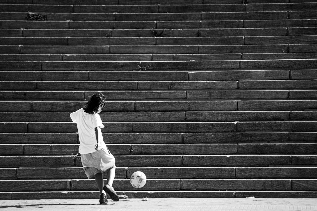
In the world of photography, contrast rarely gets the spotlight it deserves. While exposure, composition, and sharpness often take center stage, contrast quietly powers the emotional and visual impact of an image. It shapes mood, directs attention, and breathes life into photos—whether it’s a brooding black-and-white portrait or a vibrant cityscape glowing under twilight.
Mastering contrast isn’t just for professionals tinkering with sliders in post-production; it’s a foundational skill that can elevate even casual snapshots into compelling visual stories. The key is knowing how to see contrast, work with it, and not against it.
Understanding Contrast in Photography
At its core, contrast refers to the difference between the light and dark areas of an image. But it’s not limited to brightness. There’s also color contrast, where hues sit opposite each other on the color wheel, and textural contrast, where smooth and rough elements share a frame. Even conceptual contrast—such as joy in the middle of chaos—can give a photograph punch.
High contrast images are bold and dynamic. Think of a silhouette against a bright sky or the dramatic interplay of shadows and light in street photography. Low contrast images, on the other hand, are more subtle and often evoke a dreamy, nostalgic feeling. Both have their place, and understanding when to use which is what separates a good shot from a great one.
Lighting: The Gateway to Contrast
Natural light is the first and most accessible tool for shaping contrast. The golden hour, with its long shadows and warm tones, adds natural depth. Midday sun, though often harsh, can be harnessed to create high-contrast imagery that plays well with hard shadows.
Artificial light also provides opportunities to manipulate contrast deliberately. Backlighting a subject can create powerful silhouettes, while side lighting sculpts the face and textures. Studio setups allow even more precision—essential for commercial, product, or portrait photography.
For candid settings like parties or weddings, contrast helps capture the energy of the moment. A well-timed flash in a dim room can freeze laughter, highlight movement, and turn an ordinary snapshot into something truly expressive. This is one reason why high-quality photo booth rental Las Vegas services are so popular at events—they’re often equipped to handle contrast-rich environments that regular point-and-shoot setups can’t manage as well.
Black & White: Where Contrast Truly Shines
Monochrome photography strips away color and leaves contrast front and center. Every line, shadow, and highlight becomes more pronounced. Photographers often switch to black and white when an image is more about form, emotion, or storytelling than color.
But converting a color photo to black and white doesn’t automatically add drama. Effective monochrome work requires manipulating tonal contrast carefully. Use the color sliders in editing software to emphasize certain tones—lifting the brightness of a blue sky or darkening foliage to draw attention to a subject.
The beauty of black and white is that it teaches you to see contrast. Once you train your eye to spot it in everyday scenes, your color photography will improve too.
Using Contrast for Emphasis and Emotion
Contrast can be a guiding hand. In portraiture, subtle contrast between a subject’s skin and the background ensures focus without overpowering the image. In food photography, contrasting textures—glossy sauce against a rustic plate, for instance—make a dish look more appetizing.
On the emotional front, high contrast often conveys intensity: joy, fear, drama. Low contrast tends to feel soft, calm, reflective. A foggy landscape with diffused light feels poetic. A sharply lit performer on stage feels electric.
The contrast doesn’t have to come solely from light or editing. Even clothing and background choices during a shoot play a huge role. A dark outfit in front of a light wall? Instant visual interest.
Editing with a Light Touch
It’s easy to go overboard with contrast sliders during post-processing. While dramatic edits may grab attention, they can also strip an image of nuance. Always start small. Adjust curves to fine-tune shadows and highlights. Play with levels and clarity sparingly. Remember, subtlety often leaves a more lasting impression.
When editing for social media, bear in mind that screens can exaggerate contrast. What looks punchy on your phone might appear harsh on a larger display. Viewing your work across multiple devices can help keep edits balanced.
Conclusion
Contrast may not be the flashiest concept in photography, but it is undoubtedly one of the most impactful. From setting a mood to guiding the viewer’s eye, it serves as an invisible hand behind every great shot. Whether you’re photographing a quiet morning landscape, a lively reception, or guests posing in front of a photo booth rental backdrop, mastering contrast will help you capture not just an image—but a feeling.
By paying attention to how light and dark play together, how textures and colors interact, and how emotional tone can be shaped through visual balance, you’ll start creating photos that do more than just look good—they resonate.

